Modelling The Corona Virus
An interactive Python notebook to model the spread of the Corona Virus and to show visually what the phrase "Flattening The Curve" was in reference to, and why it was important.

Flattening The Curve
During the pandemic there was often a lot of talk about "flattening the curve" in reference to making sure hospital capacity was great enough to cope with new cases of Covid. I wanted to visualise this curve and explore the effect that different parameters had on the shape of the curve.
The SIR Model
We can model Corona Virus infections with the SIR Model.
The SIR model breaks down the entire population into three variables.
- S -> The number of susceptible people.
- I -> The number of infected people.
- R -> The number of removed people, (recovered or died).
We can then write equations that describe the rates of change of these variables. The rate of change of susceptible people depends upon how quickly the virus is passed from infected people to susceptible people. This is negative as the number of susceptible people is decreasing as time goes on. \[\frac{dS}{dt} = - \beta S I\] The rate of change of infected people compares the rate at which people are becoming infected with the rate of them recovering. Assuming people become infected faster than they recover, this is positive. \[\frac{dI}{dt} = \beta S I - \gamma I\] Finally, the rate at which infected people recover: \[\frac{dR}{dt} = \gamma I\]
Here we have introduced two variables:
- \(\beta\) -> The rate of transmission
- \(\gamma\) -> The rate of recovery
# @param {type:"slider", min:0, max:5, step:0.1}Solving Ordinary Differential Equations With Python
The above equations are known mathmematically as Ordinary Differential Equations, and can be tricky to solve. Luckily there are Python libraries that can do that for us! One such library is SciPy with its integrate.odeint function. To use this function we need to write our system of ODEs as python functions:
        def s_dash(time, susceptible, infected):
            '''Rate of change of susceptible.'''
            return -1 * rate_of_transmission * susceptible * infected


        def i_dash(time, susceptible, infected):
            '''Rate of change of infected.'''
            return (rate_of_transmission * susceptible * infected) - (rate_of_recovery * infected)


        def r_dash(time, infected):
            '''Rate of change of recovered.'''
            return rate_of_recovery * infected
Now to solve this system of equations odeint requires as arguments the model, the intial inputs and an array of (in our case) time values to solve over. Initially we assume that 1% of the population is infected, leaving the remaining 99% of people susceptible and of course at first no one has had the virus, so no one has recovered.
        TOTAL_POPULATION_SIZE = 1 # Total Population Size (As a fraction between 0 and 1)
        INITIAL_SUSCEPTIBLE = 0.99
        INITIAL_INFECTED = TOTAL_POPULATION_SIZE - INITIAL_SUSCEPTIBLE
        INITIAL_RECOVERED = 0

        inputs = (INITIAL_SUSCEPTIBLE, INITIAL_INFECTED, INITIAL_RECOVERED)
We can also create an array of time values using numpy's linspace function. Finally our model is very simply a combination of our earlier equations.
        def model(inputs, time):
            s = inputs[0]
            i = inputs[1]
            r = inputs[2]
            dsdt = s_dash(time, s, i)
            didt = i_dash(time, s, i)
            drdt = r_dash(time, i)

            return [dsdt, didt, drdt]
And we solve with
results = odeint(model, inputs, time)Plotting Our Results
We can plot our results for the given rate of transmission and rate of recovery using matplotlib. This will give us a graph like this:
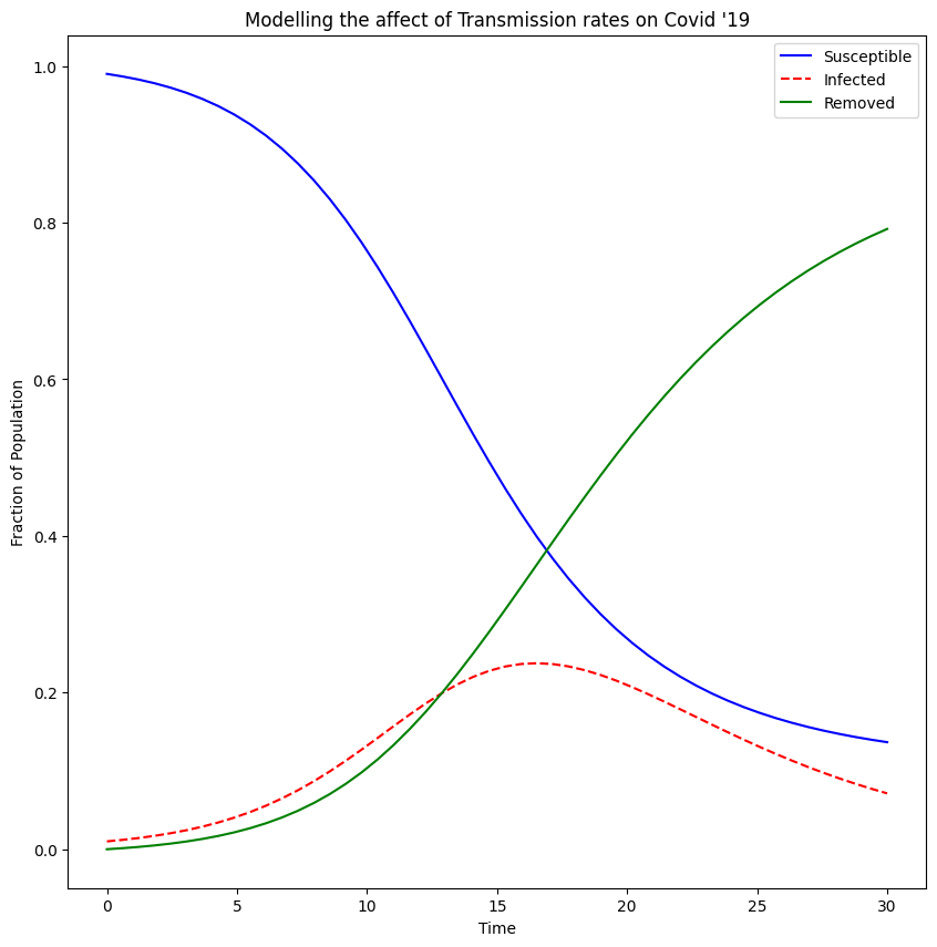
We are interested in the dotted line which is the fraction of the population which is infected. If we lower the rate of transmission the dotted curve flattens, meaning at any one point the fraction of the population which is infected is small, whereas if we increase the rate of transmission we end up with a dotted curve that peaks at a large fraction of the population. This is the dangerous eventuality the NHS wanted to avoid, as if too many people are infected at one time, they would not be able to cope with the demand on their services. So we knew we had to keep the rate of transmission down and that was what lead us to the various rules put in place to avoid contact and transmission.
Technologies Used
- Python
- Matplotlib
- SciPy
- Numpy